Document de référence des Cadrans Personnalisés
Cette page est destinée aux concepteurs de nouveaux Cadrans. Il répertorie tous les mots-clés et fonctionnalités disponibles lorsque vous voulez créer ou animer un nouveau cadran.
Les nouvelles fonctionnalités intégrées dans la V2 des Cadrans Personnalisés (Wear apk 3.3.0 ou plus) sont disponibles ici
Format des Cadrans Personnalisés
Le format des Cadrans personnalisés est ouvert et conçu specialement pour AAPS, il est associé au nouveau cadran « AAPS (perso) » disponible sur la montre.
Le fichier Cadran est un fichier zip simple, mais pour être reconnu comme Cadran AAPS, le fichier zip doit contenir:
Un fichier image nommé CustomWatchface (cela peut être un fichier bitmap
CustomWatchface.jpg,CustomWatchface.pngou un fichier vecteurCustomWatchface.svg). Ce fichier contient la petite icône utilisée pour sélectionner le cadran lorsque vous cliquez sur le bouton « Charger le cadran », et aussi l’image visible dans le plugin AAPS Wear.Un fichier nommé
CustomWatchface.json(voir Structure JSON ci-dessous). Ce deuxième fichier est le fichier principal qui contient toutes les informations nécessaires pour le cadran. Ce fichier json doit être valide (c’est probablement le point le plus délicat lorsque vous éditez manuellement ce fichier dans un éditeur de texte, parce qu’une simple virgule manquante ou additionnelle est suffisante pour casser le format json). This JSON file must also include a"metadata"block with a"name"key with not empty value. Ce sera le nom de votre cadran personnalisé (voir Paramètres metadata ci-dessous)la taille de ce zip devrait être aussi petite que possible (moins de 500 ko). Si ce fichier est trop volumineux, il sera juste bloqué et ne sera pas transmis à la montre.
Le fichier zip peut également contenir des fichiers de ressources supplémentaires :
Des noms de fichiers codés en dur pour les images qui seront utilisées dans les vues standards incluses dans le Cadran (comme
Background,CoverChart… voir Liste des fichiers de ressources codés en dur ci-dessous). Tous ces fichiers peuvent être au formatjpg,pngousvg. mais pour la plupart d’entre elles, vous devrez utiliser les formatspngousvgqui gèrent la transparence (le format jpg est plus compact que le png, mais sans aucune transparence). Notez que la meilleure qualité associée à la plus petite taille sera généralement obtenue avec les fichiers svg (format vectoriel).Additional resource files with free names. Ces fichiers supplémentaires peuvent être soit des fichiers image, soit des fichiers de polices de caractères (les formats
ttfetotfsont acceptés pour les polices). Notez que pour ces fichiers supplémentaires, lenom du fichier(sans extension) sera utilisé comme valeur de clé, dans le fichier JSON, pour spécifier où et quand ces fichiers devront être utilisésles fichiers image sont souvent utilisés comme arrière plan de vue texte ou pour une animation dynamique (comme le niveau de la batterie de 0% à 100%)
les fichiers de police de caractères vous permettent d’utiliser des polices spécifiques dans votre cadran
Structure JSON
JSON files can be edited in Notepad (or notepad++) text editor (prefer notepad++ that recognize JSON and use color formatting)
il contient les clés de type chaîne de caractère
"string_key":et les valeurs clés qui peuvent être des chaînes comme"key value", entier, booléen commetrueoufalseou encore un bloc de données.each value is separated by a comma
,Un bloc de données commence par
{et se termine par}the json file is a whole block so it starts by
{and ends by}, and inside this file all embedded blocks are associated to a"key"that should be unique within the blockTo improve readability of json file, it’s generally indented (each new key is on a new line, each new block is shifted on the right by 4 spaces characters)
Paramètres metadata
Ce bloc est le premier bloc inclus dans le fichier JSON et est obligatoire. It contains all the information associated to this watchface, like the name, the author, the date of creation or update, the author version or the plugin version.
Voir ci-dessous un exemple de bloc metadata:
"metadata": {
    "name": "Default Watchface",
    "author": "myName",
    "created_at": "07\/10\/2023",
    "author_version": "1.0",
    "cwf_version": "1.0",
    "comment": "Default watchface, you can click on EXPORT WATCHFACE button to generate a template"
},
Notez que / utilisé pour la date est un caractère spécial, pour être reconnu correctement dans le fichier json, vous devez mettre avant un caractère « d’échappement » \
Vous pouvez voir dans un fichier JSON une clé supplémentaire "filename", cette clé sera automatiquement créée ou mise à jour lorsque la montre personnalisée sera chargée dans AAPS (elle sera utilisée pour afficher à l’utilisateur le nom du fichier zip dans le dossier d’exportation), donc vous pouvez supprimer cette clé dans le bloc de métadonnées.
Paramètres généraux
Après le premier bloc avec les métadonnées, vous allez définir quelques paramètres généraux (voir Liste des paramètres généraux ci-dessous), ceci vous permet de définir les couleurs du graphique (Glucides, Bolus, Glycémies…), et aussi les couleurs par défaut pour les valeurs dans la plage cible, hyper ou hypo (couleurs par défaut de la valeur de glycémie et des flèches)
Voir ci-dessous un exemple de paramètres généraux
"highColor": "#FFFF00",
"midColor": "#00FF00",
"lowColor": "#FF0000",
"lowBatColor": "#E53935",
"carbColor": "#FB8C00",
"basalBackgroundColor": "#0000FF",
"basalCenterColor": "#64B5F6",
"gridColor": "#FFFFFF",
"pointSize": 2,
"enableSecond": true,
Paramètres ImageView
Une image personnalisée peut être utilisée en utilisant le nom de fichier correct associé à chaque ImageView inclus dans le « Layout » personnalisé du cadran, alors le bloc JSON est uniquement là pour définir la position, la taille, si la vue est visible ou non, et éventuellement ajuster la couleur :
Voir ci-dessous un exemple de bloc Image pour l’aiguille des secondes, (dans ce cas, il n’y a pas d’image incluse dans le fichier zip, donc l’image de l’aiguille des secondes par défaut sera utilisée, mais réglée avec une couleur personnalisée.
"second_hand": {
    "width": 400,
    "height": 400,
    "topmargin": 0,
    "leftmargin": 0,
    "visibility": "visible",
    "color": "#BC906A"
}
To have second_hand colored with default BG color (lowRange, midRange or highRange), you just have to modify the latest line with the keyValue bgColor
"color": "bgColor"
Paramètres TextView
TexView a plus de paramètres disponibles comparés à ImageView: vous pouvez régler la rotation (valeur entière en degrés), taille du texte (valeur entière en pixel), gravité (pour définir si la valeur du texte sera centrée (valeur par défaut), ou alignée à gauche ou à droite), définir la police, le style et la couleur de fonte, ainsi que la couleur de fond de TextView
"basalRate": {
    "width": 91,
    "height": 32,
    "topmargin": 133,
    "leftmargin": 249,
    "rotation": 0,
    "visibility": "visible",
    "textsize": 23,
    "gravity": "center",
    "font": "default",
    "fontStyle": "bold",
    "fontColor": "#BDBDBD"
},
Notez que si vous ne voulez pas gérer une vue dans votre watchface, puis mettez la touche "visibility" à "gone" mais définissez également la taille et la position en dehors de la zone visible comme ceci:
"second": {
    "width": 0,
    "height": 0,
    "topmargin": 0,
    "leftmargin": 0,
    "rotation": 0,
    "visibility": "gone",
    "textsize": 46,
    "gravity": "center",
    "font": "default",
    "fontStyle": "bold",
    "fontColor": "#BDBDBD"
},
Si la taille et la position sont dans la zone visible, vous pouvez obtenir un petit « flash » de la valeur cachée pendant la mise à jour du cadran.
Si vous voulez personnaliser l’image d’arrière-plan d’une vue texte, alors vous pouvez utiliser la clé "background": et mettre le nom du fichier image inclus dans le fichier zip comme keyValue, vous pouvez également simplement changer la couleur d’arrière-plan en utilisant la clé "color:".
"background": "fileName"
Vous avez aussi 4 vues texte spécifiques (nommées freetext1 à freetext4) qui ont un paramètre spécifique "textvalue": qui peut être utilisé pour définir par exemple une étiquette
Paramètres ChartView
La vue graphique est une vue très spécifique qui peut partager certains paramètres avec ImageView ou TextView…
Les paramètres standards pour cette vue sont très simples :
"chart": {
    "width": 400,
    "height": 170,
    "topmargin": 230,
    "leftmargin": 0,
    "visibility": "visible"
},
Les 2 paramètres supplémentaires que vous pouvez inclure pour la vue graphique sont une couleur de fond (par défaut c’est transparent), en utilisant la clé "color" ou une image d’arrière-plan en utilisant la clé "background".
Advanced features
Preferences Feature
CustomWatchface can automatically tune some watch preferences to have the correct visualization of the watchface (if authorization is given within Wear preferencesby the user).
But this feature should be used with care. Preferences are common with all other watchfaces. So several rules to respect with this feature:
never set preferences concerning hidden views
try to maximize the visible views
feel free to oversize the width of certain views:
TBR can be shown as percentage (small width, but also as absolute values much wider)
delta or avg delta with detailed information can be wide
same for iob2: this view can have total iob, but if detailed iob is selected, then text size can be very long
If you still need some very specific settings to have a correct display (in example below, if there is not enough space for detailed iob, you can « force » this parameter to false of your watch, you can include within metadata block some settings constraint like that
"metadata": {
    "name": "Default Watchface",
    "author": "myName",
    "created_at": "07\/10\/2023",
    "author_version": "1.0",
    "cwf_version": "1.0",
    "comment": "Default watchface, you can click on EXPORT WATCHFACE button to generate a template",
    "key_show_detailed_iob": false
},
If user authorize custom watchface to modify watch parameter (setting within wear plugin) then Show detailed iob will be set to « disable », and locked to disable (no modification of this parameter possible, until authorization is disabled within wear plugin parameter, or another watchface is selected)
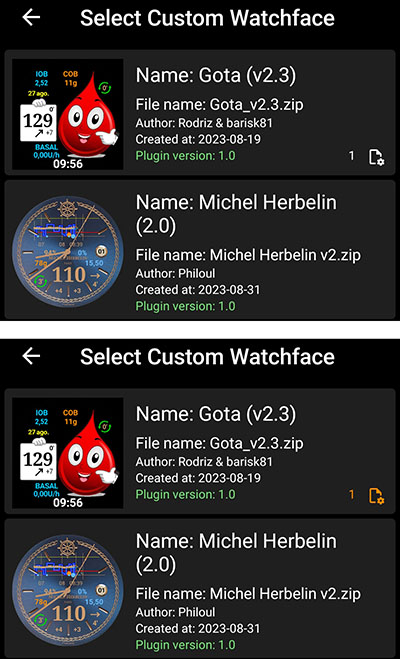
Note that when a user select a watchface, he can see the number of « required parameter » during watchface selection
In example below Gota watchface has one required parameter. If authorization is not given it will be shown in white color, but authorization is given, then this parameter will be set and locked on the watch (in this case the number is in orange color)
TwinView Feature
Twin views provide an easy way to adjust the view position based on the visible views. This does not have the power of a layout entirely made up of LinearLayout, but can handle many common cases.
In example below you can see AAPS (Cockpit) watchface with all views visible within settings, and the same watchface with « Show rig battery » disabled and « Show avg delta » disabled
You can see that when one of the twin views is hidden, the other is shifted to be centered
in this example, you can see that within "uploader_battery" block, we have "twinView": key is added to define "rig_battery" view, and in "rig_battery" block "twinView": key define "uploader_battery" as twin. Then then additional key "leftOffsetTwinHidden": define the number of pixel to shift the view when twin is hidden.
To calculate this number, you can see that the difference between the leftMargin of each of the twin views is 50 pixels, so the offset to stay centered is half in one direction or the other.
If the twin views are positioned vertically, in this case you must use the key "topOffsetTwinHidden":
DynData Feature
DynData is the most powerful feature if you want to include some animation within you watchface, according to some internal values (like BG value, BG level, delta, % of battery… see list of available data here)
To illustrate this feature, I will take the example of AAPS (SteamPunk) watchface:
In this watchface, we will have to manage the rotation of BG value (from 30 degrees to 330 degrees) on the right, the dynamic range of avg_delta (scale up to 5mgdl, 10mgdl or 20mgdl according to value), the rotation of pointer that should be synchronized to the scale, and also the different layer of the views…
To be able to manage this Watchface, see below all the images included into the zip file:
Note: to be able to see the transparency, all these images are on a yellow background and surrounded by a red square
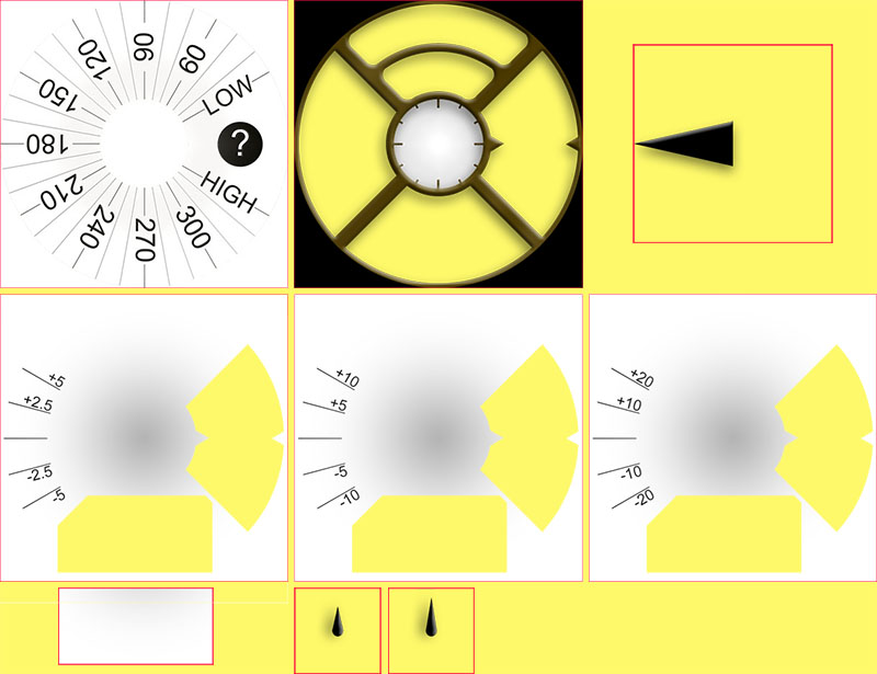
On the first row, Background.jpg and CoverPlate.png will be automatically mapped with associated view (default views filename), and steampunk_pointer.png will be managed by dynData
On the second row you see the 3 scales of dynamic range for avg_delta that will also be managed by dynData
On the third row, chartBackground.jpg will be linked manually within chart view, HourHand.png and finally MinuteHand.png files will be automatically mapped with associated views
Background management
First, concerning BG value image, no choice here, it can only be in the background layer (otherwise it will be in front of the chart view and chart will not be visible!). So we will have to map BG value to the background, and then rotate background image according to BG value.
Within "background" block, we will include 2 dedicated keys to make this rotation:
"background": {
    "width": 400,
    "height": 400,
    "topmargin": 0,
    "leftmargin": 0,
    "dynData": "rotateSgv",
    "rotationOffset": true,
    "visibility": "visible"
},
"dynData": key will define which block should be used to define the animation (value, range, conversion…) here this block was named « rotateSgv » (choose an explicit name when you use this feature),
"rotationOffset": true, will define that the expected animation according to value should be a rotation. (others available keys are "leftOffset" and "topOffset" if you want to create a slider)
Now we will go at the end of the file, after the last view:
"second_hand": {
    "width": 120,
    "height": 120,
    "topmargin": 140,
    "leftmargin": 140,
    "visibility": "gone"
},
"dynData": {
    "rotateSgv": {
        "valueKey": "sgv",
        "minData": 30,
        "maxData": 330
    },
You can see that after the latest view ("second_hand"), we added a new "dynData": { ... } block that will contains all the animations:
The block defined within "background"view was named "rotateSgv", it’s the first block you will find into "dynData"!
This block is simple: you have a first key named "valueKey": that will be used to define which value should be used. in this case "sgv" is a « keyValue » that defines BG value (note that in most cases the keyValue has the same name that the view that shows this information).
Concerning BG value, default min data is set to 39mgdl and max data is set to 400mgdl (see DynData reference key values below all available keyValues and associated min/max data values).
Within "rotateSgv" block the two additional keys ("minData": and "maxData":) will be used to tune min and max data to 30 and 330. With these min and max values, we will be able to directly use data value (without any conversion) to rotate background in degrees. In this situation all BG values above 330mgdl will be limited to 330, upper limit of the image.
Chart management
Default background of chart is transparent, so to hide BG scale included into background image, we will need to include a dedicated background image (this image will include the overall shadows of Steampunk watchface). The link to charBackground.jpg file is done with "background": key
Of course, the sizing and positioning of the view must be done to the pixel!
"chart": {
    "width": 216,
    "height": 107,
    "topmargin": 280,
    "leftmargin": 80,
    "visibility": "visible",
    "background": "chartBackground"
},
Avg delta management
To be able to manage dynamic range of avg delta, we will use the four freetext views. freetext1 will be used to manage the image scale, and freetext2 to freetext4 will be used to manage pointer rotation according to scale.
freetext1
As explain before, freetext views are in front of chart and in front of background, that’s why we included transparent area to see these images (right side and bottom side of the image)
Note that the removed bottom part of these images has been used as background of chart to have a perfect integration.
"freetext1": {
    "width": 400,
    "height": 400,
    "topmargin": 0,
    "leftmargin": 0,
    "rotation": 0,
    "visibility": "visible",
    "dynData": "avgDeltaBackground"
},
For this view we include the link to another "dynData"block named avgDeltaBackground. This block will manage avgDelta scale according to avgDelta value.
"avgDeltaBackground": {
    "valueKey": "avg_delta",
    "minData": -20,
    "maxData": 20,
    "invalidImage": "steampunk_gauge_mgdl_5",
    "image1": "steampunk_gauge_mgdl_20",
    "image2": "steampunk_gauge_mgdl_20",
    "image3": "steampunk_gauge_mgdl_10",
    "image4": "steampunk_gauge_mgdl_5",
    "image5": "steampunk_gauge_mgdl_5",
    "image6": "steampunk_gauge_mgdl_10",
    "image7": "steampunk_gauge_mgdl_20",
    "image8": "steampunk_gauge_mgdl_20"
},
"valueKey":will make the link with"avg_delta"valuemin and max Data will also limit the range to the maximum value available within this watchface (from -20mgdl to 20mgdl). For mmol users, keep in mind that all internal values are always in mgdl within AAPS.
Then we will see here how to manage dynamic background image according to value.
"invalidImage": is the key to manage image to show when we have an invalid data (or missing data). Here we make the link to additional resource image including into zip file with 5 mgdl scale
Then we will use a series of images, starting from "image1": to "image8":. The number of provided images will define the number of steps between minData and maxData.
image1will define image to show when avg_delta is equal or close tominDataand the image with the highest number (hereimage8) will be used to define the image that should be shown when avg_delta is equal or close tomaxDatabetween -20mgdl and 20mgdl, the overall range is 40mgdl, divided by 8 (number of images provided), we will have 8 steps of 5mgdl
Now we can map background images according to avg_delta value, starting from the lowest values: between -20 and -15, and also between -15 and -10 we will use
steampunk_gauge_mgdl_20for the scale, then between -10 and -5steampunk_gauge_mgdl_10, and so on until +15 and +20 where we will again usesteampunk_gauge_mgdl_20background image
freetext2 to freetext4
For these views will will combine dynamic images and rotation feature explained before:
"freetext2": {
    "width": 276,
    "height": 276,
    "topmargin": 64,
    "leftmargin": 64,
    "rotation": 0,
    "visibility": "visible",
    "dynData": "avgDelta5",
    "rotationOffset": true
},
"freetext3": {
    "width": 276,
    "height": 276,
    "topmargin": 64,
    "leftmargin": 64,
    "rotation": 0,
    "visibility": "visible",
    "dynData": "avgDelta10",
    "rotationOffset": true
},
"freetext4": {
    "width": 276,
    "height": 276,
    "topmargin": 64,
    "leftmargin": 64,
    "rotation": 0,
    "visibility": "visible",
    "dynData": "avgDelta20",
    "rotationOffset": true
},
Here each view is dedicated to a specific scale (so is linked to a dedicated dynData block), you can also notice that "rotationOffset": key is enabled for these 3 views.Now take a look on the first dynData block:
"avgDelta5": {
    "valueKey": "avg_delta",
    "minData": -20,
    "maxData": 20,
    "rotationOffset": {
        "minValue": -120,
        "maxValue": 120
    },
    "invalidImage": "null",
    "image1": "null",
    "image2": "null",
    "image3": "null",
    "image4": "steampunk_pointer",
    "image5": "steampunk_pointer",
    "image6": "null",
    "image7": "null",
    "image8": "null"
},
Here, even if dynamic range will be used only between -5 and +5 avg_delta data, it’s important to keep the overall range of -20, +20mgdl to ensure that the pointer will be synchronize with the background during scale switches. That’s why we keep the same overall range than for avgDeltaBackground and the same number of steps (8 images).
You can note that either "invalidImage" or several "imagexx" are with "null" key value (it could be any string not existing as a filename within zip file). When a filename is not found, then view background image will be transparent. So the setting ensure that pointer will only be visible for step 4 and step 5 (avg delta between -5mgdl and +5 mgdl), and will not be visible outside this range.
Now we can see a new block "rotationOffset": that will have inside two keys "minValue": and "maxValue":. These values are used to make the conversion between internal data (in mgdl), and the angle rotation we want to have.
Steampunk watchface is designed to have maximum from -30 degrees to 30 degrees rotation for the pointer. So according to the scale (here from -5mgdl to 5mgdl), we will want to have 30 degrees for these values. Because
minDataandmaxDataare 4 times greater, then the corresponding minValues and maxValues are 4 * 30 degrees so -120 and +120 degrees. But for all rotation above or below +-30 degrees the pointer will be hidden (no image visible), and the pointer will only be visible for values between -5 and +5mgdl… So it’s exactly what is expected here.
The other dynData blocks are defined the same way to tune "avgDelt10"and "avgDelta20"
loop view
in Steampunk watchface loop green and red arrows (for status) are disabled, this is also managed with a dedicated dynData block associated to loop view.
    "loopArrows": {
        "invalidImage": "greyArrows",
        "image1": "greenArrows",
        "image2": "redArrows"
    }
Because this block is only called by loop View, and default data managed by this view is loop information, then "valueKey": key is optional.
Default minData and maxData for loop are defined to 0min and 28min, so with two images, all data values below 14 min will be shown with background image1 and all data values above 14 min will be shown with image2. 14 min is exactly the threshold to switch from green arrow to red arrow.
In this example, greyArrows, greenArrows and redArrows files are not included into zip file, so these arrows are just removed (invisible), but you can use this block « as is » if you want to tune status arrows with custom background images.
rig_battery and uploader_battery views
To finish the overview of dynData feature, we will take a look on battery management. The idea here is to customize text color according to battery level (from 0 to 100%)
"uploader_battery": {
    "width": 60,
    "height": 28,
    "topmargin": 100,
    "leftmargin": 170,
    "rotation": 0,
    "visibility": "visible",
    "textsize": 20,
    "gravity": "center",
    "font": "default",
    "fontStyle": "bold",
    "fontColor": "#00000000",
    "dynData": "batteryIcons",
    "twinView": "rig_battery",
    "topOffsetTwinHidden": -13
},
"rig_battery": {
    "width": 60,
    "height": 28,
    "topmargin": 74,
    "leftmargin": 170,
    "rotation": 0,
    "visibility": "visible",
    "textsize": 20,
    "gravity": "center",
    "font": "default",
    "fontStyle": "bold",
    "fontColor": "#00000000",
    "dynData": "batteryIcons",
    "twinView": "uploader_battery",
    "topOffsetTwinHidden": 13
},
You can see here that these both views share the same dynData block named batteryIcons. It’s possible because by default attached data is the one of the view (to without specifying a "valueKey": key within batteryIcons block, it will be applied with uploader_battery data or rig_battery data according to the view).
Note these two views also use TwinView feature explain here.
Now lets take a look on dynData block:
"batteryIcons": {
    "invalidFontColor": "#00000000",
    "fontColor1": "#A00000",
    "fontColor2": "#000000",
    "fontColor3": "#000000",
    "fontColor4": "#000000",
    "fontColor5": "#000000"
},
Here we use exactly the same logic that for dynamic background image, but with dedicated keys ("invalidFontColor" and "fontColor1" to "fontColor5" to specify 5 steps of 20% each one).
"fontColor1"(dark red) will be used for all values below 20%, and white will be used for all values above this threshold.If you want to lower the threshold to « below 10% », you just have to add 5 additional keys from
"fontColor6"to"fontColor10", but you can also adjust each color if you want progressive variation from green to yellow, orange and red…
DynPref Feature
Before reading this chapter, you have to understand how dynData works, because DynPref is an advanced usage of DynData: You will now be able to adjust each DynData block according to preferences set by the user:
To illustrate DynPref feature, we will use two example:
Steampunk watchface (simple use to include into the same watchface mgdl and mmol version, watchface will automatically switch according to unit selected into aaps).
AAPS V2 watchface will combine different preferences to be able to manage text color and background according to dark and match divider preferences.
Simple usage of dynPref within Steampunk watchface
Within Steampunk, we have to set of images according to units: background image that will have BG scale and will turn according to BG value. and freeText1 that contains dynamic scale according to avgDelta value.To be able to have one watchface that will automatically show correct units, we should select image according to unit selected.
To do that we will replace dynData key by a dynPrefkey within view block:
 "background": {
    "width": 400,
    "height": 400,
    "topmargin": 0,
    "leftmargin": 0,
    "dynPref": "rotateSgv",
    "rotationOffset": true,
    "visibility": "visible"
},
Usage of dynPrefkeys will be very close to dynDatakeys explained in previous chapter
Now we will take a look at the end of the json file, after dynData block:
"dynData": {
    ...
},
"dynPref": {
    "rotateSgv": {
        "prefKey": "key_units",
        "true": {
            "valueKey": "sgv",
            "minData": 30,
            "maxData": 330,
            "invalidImage": "Background_mgdl",
            "image1": "Background_mgdl"
        },
        "false": {
            "valueKey": "sgv",
            "minData": 30,
            "maxData": 330,
            "invalidImage": "Background_mmol",
            "image1": "Background_mmol"
        }
    },
    ...
}
You can see that the dynpref key defined within background view block ("dynPref": "rotateSgv") exists into the dynPref json block included at the end of json file:
This block should contains a "prefKey"key that will define which preference should be used. In this example the key "key_units" is linked to units selected within AAPS on phone, and value is "true"if selected unit is mgdl, "false"if selected unit is mmol.
Then you will find two json blocks that will use « dynData » format, and that will be used according to selected preference
Note that the « HardCoded » file name for Background image is now replaced by a dynamic image that will be the same whatever the BG value (Background_mgdl.pngfile if key_units is « true », Background_mmol.png if key_units is false), and we also include an ` »invalidImage » key to always have a background image even if no data has been received from the phone.
Combine different preferences within dynPref with AAPS V2
Most of the time, when you set a preference, it’s not to get « dynamic behaviour », but only the results according to what you select, but within dynPref, it’s considered as a dynamic feature…
when in
dynDatayou specify one full block of parameters (with images, fontColor, Color, …), withdynPref, you will be able to combine each parameter according to one specific preference.Here we will see how match divider preference will be associated to dark preference to show when it’s enabled (true) white text on black background on dark watchface (dark parameter true) or black text on white background on light watchface (dark false)…
First lets see the beginning of json file:
"dynPrefColor": "prefColorDark",
"pointSize": 2,
"enableSecond": false,
"background": {
    "width": 400,
    "height": 400,
    "topmargin": 0,
    "leftmargin": 0,
    "visibility": "visible",
    "dynPref": "dark"
},
"dynPrefColor": "prefColorDark" will specify the dynPref block of all default colors outside views. These colors will be tuned according to dark parameter within "prefColorDark":
And at the end, within the dynPref block, you will have a specific dynPref block for default colors:
"prefColorDark": {
    "prefKey": "key_dark",
    "true": {
        "highColor": "#FFFF00",
        "midColor": "#00FF00",
        "lowColor": "#FF0000",
        "lowBatColor": "#E53935",
        "carbColor": "#FB8C00",
        "basalBackgroundColor": "#0000FF",
        "basalCenterColor": "#64B5F6",
        "gridColor": "#FFFFFF"
    },
    "false": {
        "highColor": "#A0A000",
        "midColor": "#00A000",
        "lowColor": "#A00000",
        "lowBatColor": "#E53935",
        "carbColor": "#D07C00",
        "basalBackgroundColor": "#0000A0",
        "basalCenterColor": "#64B5F6",
        "gridColor": "#303030"
    }
}
The difference between this dynPref block and the other standard dynPref blocks used for views is that here you don’t have a dynData block for each value of "key_dark" parameter, but only the list of main colors (highColor, midColor , …)
Lets now take a look on items included into the « divider banner » (in example below "basalRate" view linked to "matchDivider" dynPref view:
"basalRate": {
    "width": 90,
    "height": 32,
    "topmargin": 127,
    "leftmargin": 242,
    "rotation": 0,
    ...
    "leftOffsetTwinHidden": 33,
    "dynPref": "matchDivider"
},
Then within dynPref block, you can see that Match divider parameter (key_match_divider key), include the 2 blocks « true » and « false », but these two blocks are only used to define that view will use either « dark » dynBlock (so exactly the same background and text color than the otherviews outside the banner), or « white » dynBLock that will set opposite colors for background and text…
"matchDivider": {
    "prefKey": "key_match_divider",
    "true": {
        "dynPref": "dark"
    },
    "false": {
        "dynPref": "white"
    }
},
"dark": {
    "prefKey": "key_dark",
    "true": {
        "color1": "#000000",
        "fontColor1": "#FFFFFF"
    },
    "false": {
        "color1": "#FFFFFF",
        "fontColor1": "#000000"
    }
},
Note that here you are within a « dynData » block, then to define a color or a fontColor, you will use a dynData (not specified here), and a single step ("color1" and 'fontColor1' are used)
for all parameter other than
imagedefault « invalid value (if not set specifically by"invalidColor"key or"invalidFontColor"keys) will be"color1"and"fontColor1".
Then we will see a third example with iob views (iob1 and iob2), where we will use smaller text for detailed iob and bigger text for total iob:
"iob1": {
    "width": 125,
    "height": 33,
    "topmargin": 168,
    "leftmargin": 275,
    "rotation": 0,
    "visibility": "visible",
    "textsize": 19,
    ...
    "dynPref": "prefIob1"
},
"iob2": {
    "width": 125,
    "height": 33,
    "topmargin": 196,
    "leftmargin": 275,
    "rotation": 0,
    "visibility": "visible",
    "textsize": 24,
    ...
    "leftOffsetTwinHidden": -10,
    "dynPref": "prefIob2"
},
You will see within default view settings the text size (19 on iob1 and 24 on iob2) and the two different dynPref block that should tune textsize (according to detailed iob parameter), and colors (according to dark parameter)
"prefIob1": {
    "prefKey": "key_show_detailed_iob",
    "true": {
        "dynPref": "dark",
        "textsize1": 24
    },
    "false": {
        "dynPref": "dark"
    }
},
"prefIob2": {
    "prefKey": "key_show_detailed_iob",
    "true": {
        "dynPref": "dark",
        "textsize1": 19
    },
    "false": {
        "dynPref": "dark"
    }
},
You can see here that according to detailed iob parameter ("key_show_detailed_iob" key), when it’s « true » then textsize is defined to a fix value bigger than default (24 instead of 19): this is done using textsize « step » feature, within only one value so one step… (note that for all parameter others than images,if invalidTextSize is not set, then textsize1 will be used for invalid data)
Then « dark » dynPref block will be used to set colorand fontColor
In this example the dynData block that will be used for iob1 view will be if detailed IOB is enabled and dark enabled:
{
    "color1": "#000000",
    "fontColor1": "#FFFFFF",
    "textsize1": 24
},
So the text will be inwhite on black background and the size 24 will replace default size of 19 set into the view
The dynData block that will be used for the same view iob1 if detailed IOB is disabled and dark disabled will be:
{
    "color1": "#FFFFFF",
    "fontColor1": "#000000"
},
Now the text will be in black on white background with a size of 19
Tips and tricks for dynPref
You can combine as many pref than you want, but be careful, the number of blocks to describe can increase very fast (it’s exponential): if you chain 3 parameters and you want to define all situations, you will have 8 blocks to describe, if each parameter has only 2 values…
Be careful to not build « infinite loop » (for example if dynpref1 block should be completed by dynpref2 block that should be completed by dynpref1 block…). In this case the dynpref blocks will be considered as invalid…
Do not forget to include the numéric index after the key (when you use for example
"textsize"key within a view, you will have to use"textsize1"within the dynPref value block, because it’s a « dynData » format, so linked to value with a single step in this case)Only one key
"valueKey"should be set for one view, so if the finaldynDatablock is built from severaldynPrefblocks, do not include several"valueKey"(and associated"minData","maxData", …)
New Features in CustomWatchface V2 (AAPS V3.3.0 or above)
Note that the watchfaces using these new features or views will require the latest wear apk built from 3.3.0 version of AAPS.
If you use a zip « v2 » with a watch that includes CustomWachface V1, you will have missing information or wrong content into the watchface.
CustomWatchface V2 includes these new features:
Show External data for Follower (up to 3 set of data within one single Watchface, for AAPS, AAPSCLIENT and AAPSCLIENT2)
New Status view
The key of this view is "status" and associated block is automatically included into the template exported from wear apk « Custom Watchface V2 » (built from AAPS 3.3.0 version or above)
This view was included into previous AAPS (NoChart), AAPS (BigChart) and AAPS (Large) previous existing watchfaces available and include a string value (built within wear apk).
These previous watchfaces has been removed and replaced by 3 new custom watchfaces in AAPS 3.3.0.
the minimum information is IOB value (always visible whatever IOB parameter into watch)
then you have detailed IOB values (BolusIOB|BasalIOB) if enabled within preferences
and BGI value (again if enabled within preferences)
This "status" view is associated with "key_show_loop_status" key (within dynPref) to manage visibility.
This view could be managed in V1 using "iob1", "iob2" and "bgi" existing views, but with the need of complex dynPref settings to manage spacing within each information according to different settings selected within Watch.
New TempTarget view
The key of this view is "tempTarget" and associated block is automatically included into the template exported from wear apk « Custom Watchface V2 » (built from AAPS 3.3.0 version or above).
It shows within watchface:
Profile target (single value or min-max target values) (default color in white)
Loop adjusted target (default color in Green)
Temp Target defined by user (default color in Yellow)
This "tempTarget" view is associated with "key_show_temp_target" key (within dynPref) to manage visibility.
The DynData Key (associated with color information) is "tempTarget" (default DynData key associated with TempTarget View)
DynData value equals:
0 (Profile Target),
1 (Loop Target) or
2 (User Temp Target)
Note that this view is also available for external data (see below) with "tempTarget_Ext1" and "tempTarget_Ext2" keys (View and DynData)
New Reservoir Level view
The key of this view is "reservoir" and associated block is automatically included into the template exported from wear apk « Custom Watchface V2 » (built from AAPS 3.3.0 version or above).
This view show Reservoir level (in U) with a White default color, Yellow if Warning Level, Red if Urgent Level
This "reservoir" view is associated with "key_show_reservoir_level" key (within dynPref) to manage visibility.
The DynData Keys associated with Reservoir Level are:
"reservoir"(Default DynData Key associated with Reservoir Level view) associated with level in insulinUMin Value is 0.0 U
Max Value is 500.0 U
"reservoirLevel"0 (Standard Level, White Color by default)
1 (Warning Level, Yellow color by default)
2 (Urgent Level, Red color by default)
Note that this view is also available for external data (see below) with "reservoir_Ext1", "reservoir_Ext2", "reservoirLevel_Ext1" and "reservoirLevel_Ext2" keys (View and DynData).
New Formatting feature for DynData or DynPref
You can now manage a custom formatting of raw values received by the watch and included in dyndata key value table below.
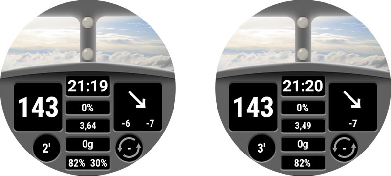
To illustrate how this feature works, lets take as an example AAPS (Large) watchface and look at the results according to « time ago value » and the new « status » view visible or not:

In first screenshot in the left, status view is visible (with IOB, detailed IOB and BGI), so only 1/3 of the line is available to show timestamp (very compact information with
1', and for uploader battery informationU: 55%)In second screenshot, now
statusview has been hidden in watch parameter, so you have a lot of place available to show full label for timestamp information and uploader battery (1 minute agoandUploader : 55%)In the third screenshot in the right, you have exactly the same setting within watch, but now timestamp has changed and is above « 1 ». now the custom watchface is able to show the label updated with plural management (
2 minutes ago)
I will not explain below how the whole views are managed within zip file (positioning of each view according to different settings), but I will only focus on the way we manage formatting feature and associated dynamic value within AAPS (Large) watchface.
This feature requires « dynamic block » (it can be either a dynData block or a dynPref block)
For AAPS (Large) Watchface, we wanted to have the format tuned according to parameters (short or long format according to
statusview visibility) so we used adynPrefblock for that.
First lets start by the views:
"uploader_battery": {
    "width": 200,
    "height": 50,
    "topmargin": 175,
    "leftmargin": 0,
    "rotation": 0,
    "visibility": "visible",
    "textsize": 25,
    "gravity": "center",
    "font": "roboto_condensed_light",
    "fontStyle": "normal",
    "dynPref": "uploader",
    "dynValue": false,
    "fontColor": "#BDBDBD"
},

"timestamp": {
    "width": 200,
    "height": 50,
    "topmargin": 175,
    "leftmargin": 0,
    "rotation": 0,
    "visibility": "visible",
    "textsize": 25,
    "gravity": "center",
    "font": "roboto_condensed_light",
    "fontStyle": "normal",
    "dynPref": "timestamp",
    "dynValue": false,
    "fontColor": "#FFFFFF"
},
here the most important key is "dynValue": Having this key information will enable dynamic management of raw value. the boolean behind (true or false) will define if value should be « converted or not »
false: raw value will be use as it is without any limitation or conversiontrue: raw value will be converted (usingminDataandmaxDatakeys in dynData block and usingminValueandmaxValuedefined in dynData)
For this watchface, raw values are used without any conversion, so for both views, "dynValue" key as been set to false.
Now we will take a look on "uploader" block defined within "dynPref":
"uploader": {
    "prefKey": "key_show_loop_status",
    "true": {
        "dynPref": "uploader_true_ago",
        "invalidTextvalue": "U: --",
        "textvalue1": "U: %.0f%%"
    },
    "false": {
        "dynPref": "uploader_false_ago",
        "invalidTextvalue": "Uploader: --",
        "textvalue1": "Uploader: %.0f%%"
    }
},
By default "uploader_battery" view is linked to "uploader_battery" , so no need to add an explicit line with
"valueKey": "uploader_battery" (min value 0, max value 100, and raw value is percentage of phone battery)
The formatting string is included into "textvalue1" key ("textvalue1", "textvalue2", etc keys are linked to "textvalue" key that could be included into view block)
"textvalue"key can be used with formatting information within the view block (in this situation format will be static, whatever the value or the settings)If you want to modify formatting information according to settings or values, thenall dynData feature can be applied, and the dedicated keys are
"invalidTextValue"key (without « formatting information » because value is not valid) and"textvalue1","textvalue2"… (and as many values that you want to manage steps between minData and maxData)the additional
"dynPref"keys are used to define other blocks for positioning variation and color variation depending on visible views, dark and matchDivider settings
Concerning now the formatting string, syntax is the following: %[flags][width][.precision]f
%is the beginning of a formatting,fis the end and should be used for Double value conversion.Note that if you want to use
%character within your string, you will have to use%%to specify that it’s not a formatting string but percentage character.
[flag]is optional, mainly can be+if you always want a sign before the number, or(if you want negative values in parentheses[width]is optional, define the minimum number of characters to be written to the output[.precision]used to define number of digits after radix point.Note that values are Double so it’s wise to always set a precision (to avoid a lot of characters after radix point due to kotlin precision)
So in the above example %.0f will show Double value as an integer
Let’s now take a look on timestamp dynPref block to manage plural:
"timestamp": {
    "prefKey": "key_show_loop_status",
    "true": {
        "dynPref": "timestamp_true_uploader",
        "invalidTextvalue": "U: --",
        "textvalue1": "%.0f'"
    },
    "false": {
        "dynPref": "timestamp_false_uploader",
        "minData": 0,
        "maxData": 3,
        "invalidTextvalue": "-- minute ago",
        "textvalue1": "%.0f minute ago",
        "textvalue2": "%.0f minutes ago"
    }
},
here if
statusview is visible (so"key_show_loop_satus"key istrue), a single format is used ("textvalue1"), with'as « unit »if
statusview is hidden, you have 2 different format used one for 0 or 1 with singular, and another format for values above 2 with plural"minData"and"maxData"are used to define the range and be sure the switch from singular to plural will be done between 1 and 2 valuesNote that
"maxData"(integer) has been set to 3 and not 2, just because Double data managed into the system is not integer, so a value a bit above or a bit lower 1 may have singular or plural format even if after rounding to integer, the value equals 1.
For
timestampview, it’s important to set"dynValue"key tofalse, otherwise because of formatting (singular/plural), all values above 3 will be limited to3 minutes agowith conversion usingmaxData…
Additional comment concerning formatting feature
keep in mind that the only dynamic values available are the one listed here
All
BGvalues are in mgdl unit, if you want to use formatting feature to show values in mmol units, you will have to manage mgdl to mmol conversion. Within adynDataordynPrefblock, the key that should be used to name the block that will include"minValue"and"maxValue"for value conversion should be named"dynValue": { ... }. (see Dyn Data Keys)If within a view you want to use a static formatting string, with
"textvalue"key to define format, and"dynValue"key to define usage of dynamic value, then you will have to also use a"dynData"or a"dynPref"block (even if empty), to be able to use formatting feature."textvalue1","textvalue2"to textvaluen can be used without formatting feature to replace double value step by a dedicated text label (for example with"day_name"key value and seven steps to define custom name of the dayx of the week, … )For full documentation you can see Class Formatter
Show External data for Follower
Custom Watchface is now able to display on the same watchface up to 3 set of data: AAPS, AAPSCLIENT and AAPSCLIENT2
To use this feature, you need to:
have at least 2 of the 3 following apps installed in phone (AAPS, AAPSCLIENT, AAPSCLIENT2)
enable Broadcast data in AAPSCLIENT and/or AAPSCLIENT2 to broadcast data to the main app used to sync with CustomWatchface (AAPS or AAPSCLIENT)
Use a CustomWatchface that implement Views with Key including
_Ext1or_Ext2(see Key and KeyValue reference below)
Note that if main app in phone is AAPSCLIENT and secondary app which broadcast data is AAPSCLIENT2, you will have to enable Switch external data in watchface parameter within Custom Watchface dedicated parameter if you use a watchface which use standard views and Ext1 additional views (Ext1 is linked to AAPSCLIENT and Ext2 is linked to AAPSCLIENT2)
Additionally three new views ("patient_name" , "patient_name_Ext1" and "patient_name_Ext2" *) has been added to be able to automatically include patient name (set within AAPS preferences) within watchface (see example below)

Key and KeyValue reference
Liste des clés des métadonnées
List of Standard information metadata keys
Clé |
Commentaire |
|---|---|
|
Nom du cadran personnalisé |
|
Nom ou pseudo du ou des auteur(s) |
|
Creation (or update) date, be careful |
|
Version du Plugin Wear compatible avec la conception de votre cadran (laissez cette valeur inchangée) |
|
L’auteur peut spécifier ici la version de son cadran |
|
Texte libre qui peut être utilisé pour donner des informations complémentaires ou des limitations du cadran actuel |
Preference keys
Clé |
Default value and Comment |
|---|---|
|
true will lock detailed IOB data on view |
|
false (only if design is not compatible with the width of detailed delta for |
|
true if your design requires |
|
true if your design requires |
|
true if your design requires |
|
true if your design requires |
|
true if your design requires |
|
true if your design requires |
|
true if your design requires |
|
true if your design requires |
|
true if your design requires |
|
true if your design requires |
|
true if your design requires |
|
true if your design requires |
|
true if your design requires |
|
true if your design requires |
|
true if your design requires |
|
true if your design requires |
Internal keys
Clé |
Comment and |
|---|---|
|
This key will be created (or updated) automatically when the watchface is loaded and will contains local zip filename within exports folder |
|
this key will be created (when the watchface is loaded) and updated each time authorization preference is changed in Wear settings, and it will be used to synchronize authorization to watch |
Liste des paramètres généraux
Clé |
Commentaire |
|---|---|
|
|
|
|
|
|
|
|
|
|
|
|
|
|
|
|
|
2 (default): size of points in graph (1 for small point, 2 for big points) |
|
false (default): specify if watchface will manage seconds or not within |
|
« E » (default): from « E » to « EEEE » specify dayname format (number, short name, full name) tbc |
|
« MMM » (default): from « M » to « MMMM » specify month format (number, short name, full name) |
Liste des fichiers de ressources codés en dur
Pour la plupart des images, le suffixe « High » et « Low » permet de régler l’image selon le niveau de glycémie (dans la gamme, l’Hyper ou Hypo)
Noms des fichiers |
Commentaire |
|---|---|
CustomWatchface |
Image shown for watchface selection and within Wear plugin |
Background, |
none (default black): Background image. background is always visible and default color is black if no image provided. Color can be modified to fit watchface design |
CoverChart, |
none (default): Image in front of Chart (transparency should be available to see Chart behind) Can be used to limit boundaries of graph |
CoverPlate, |
simple dial (default): image in front of all text values. transparency mandatory to see all values that are behind |
HourHand, |
hour_hand (default): image of hour hand. a default image is provided and can be colored to fit analog design. Note axis for rotation will be the center of the image |
MinuteHand, |
minute_hand (default): image of minute hand. a default image is provided and can be colored to fit analog design. Note axis for rotation will be the center of the image |
SecondHand, |
second_hand (default): image of second hand. a default image is provided and can be colored to fit analog design. Note axis for rotation will be the center of the image |
ArrowNone |
?? (par défaut) : image affichée quand aucune flèche valide n’est disponible. |
ArrowDoubleUp |
↑↑ (par défaut) : image de double flèche vers le haut |
ArrowSingleUp |
↑ (par défaut) : image de simple flèche vers le haut |
Arrow45Up |
↗ (default): image of fortyfive arrow up |
ArrowFlat |
→ (default): image of flat arrow |
Arrow45Down |
↘ (default): image of fortyfive arrow down |
ArrowSingleDown |
↓ (default): image of single arrow down |
ArrowDoubleDown |
↓↓ (default): image of double arrow down |
For each above filenames, extension can be either .jpg, .png or .svg. But be careful, .jpgdoesn’t manage transparency (so most of the files should be with .png or .svg to not hide view that are behind…)
Liste des clés pour les vues
This list is sorted from background to foreground this is very important when you organize your watchface to know this order because some image or text can be hidden by other images.
Note: all keys including _Ext1 or _Ext2 at the end are new and dedicated for multi users Watchfaces.
Clé |
Type de vue |
Données associées |
Clé DynData |
|---|---|---|---|
|
Image View |
||
|
Specific Chart View |
Courbes graphiques |
|
|
Image View |
||
|
Text View |
||
|
Text View |
||
|
Text View |
||
|
Text View |
||
|
Text View |
Patient Name |
|
|
Text View |
IOB label or IOB Total |
|
|
Text View |
IOB Total or IOB Detailed |
|
|
Text View |
Carb label |
|
|
Text View |
COB Value |
|
|
Text View |
Short delta (5 min) |
delta |
delta_Ext1 |
|||
|
Text View |
Avg Delta (15 min) |
avg_delta |
|
Text View |
BG Target (single value or min - max targets values) |
tempTarget |
|
Text View |
Reservoir level |
reservoir |
|
Text View |
phone battery level (%) |
uploader_battery |
|
Text View |
rig battery level (%) |
rig_battery |
|
Text View |
% or absolute value |
|
|
Text View |
mgdl/(5 min) or mmol/(5 min) |
|
|
Text View |
Synthesis of IOB (whatever IOB setting in watch), Detailed IOB (according to setting in watch and BGI (according to setting in watch) |
|
|
Text View |
HH:MM or HH:MM:SS |
|
|
Text View |
HH |
|
|
Text View |
MM |
|
|
Text View |
SS |
|
|
Text View |
AM ou PM |
|
|
Text View |
nom du jour (cf. dayNameFormat) |
day_name |
|
Text View |
DD date |
jour |
|
Text View |
(WW) week number |
week_number |
|
Text View |
month name (cf. monthFormat) |
|
|
Text View |
min ago since last run and status (color arrows in background), color arrows can be tuned with DynData |
loop |
|
Image View |
TrendArrows |
direction |
|
Text View |
entier (il y a xx minutes) |
timestamp |
|
Text View |
glycémie (mgdl ou mmol) |
sgv |
|
Image View |
||
|
Image View |
||
|
Image View |
||
|
Image View |
*View added in Custom Watchface V2.0 or above (available on AAPS 3.3.0 wear apk or above)
Liste des clés Json
Clés communes
elles peuvent être utilisées sur tous les types de vue (vue texte, vue image, vue graphique)
Clé |
Type |
Commentaire / valeur |
|---|---|---|
|
entier |
largeur de vue en pixel |
|
entier |
height of view in pixel |
|
entier |
marge supérieure en pixel |
|
entier |
marge gauche en pixel |
|
entier |
angle de rotation en degrés |
|
chaîne |
voir la table des Clés Valeur |
|
chaîne |
key block name that will specify dynamic data to link and associated animation (colors, image, shift, rotation) |
|
booléen |
include this key with key value true to enable horizontal shift (positive or negative value) due to dynData value |
|
booléen |
include this key with key value true to enable vertical shift (positive or negative value) due to dynData value |
|
booléen |
include this key with key value true to enable rotation (positive or negative value) due to dynData value |
|
chaîne |
key of the other view (generally the other view also include the twinView parameter with the key of this view in it) |
|
entier |
number of pixel to shift view position vertically if twin view is hidden (positive or negative value) |
|
entier |
number of pixel to shift view position horizontally if twin view is hidden (positive or negative value) |
|
chaîne |
key block name that will specify dynamic pref to link and associated animation (colors, image, shift, rotation) |
Clés des vues texte
Clé |
Type |
comment |
|---|---|---|
|
entier |
size of font in pixel (keep in mind that font can include top and bottom margin so the real text size will generally be smaller than the number of pixel set). Note that size should be smaller than view height to not be truncated |
|
chaîne |
voir la table des Clés Valeur |
|
chaîne |
see key value table for available fonts. |
|
chaîne |
voir la table des Clés Valeur |
|
chaîne |
Manage color of the font |
|
booléen |
true if you want text in uppercase (mainly day name or month name) |
|
chaîne |
|
|
chaîne |
Manage the color of view Background or tune color of image (if bitmap only) |
|
chaîne |
Key specific to the 4 free text views included into the layout (from freetext1 to freetext4), this allow you to set the text that should be included (can be a label, or just |
From Custom Watchface plugin v2 (AAPS 3.3), textvalue can be used to include a format string for the other textViews (to use with |
||
|
booléen |
true if you want to include raw value in (double). Useful with |
*Key added in Custom Watchface V2.0 or above (available on AAPS 3.3.0 wear apk or above)
ImageView keys
Clé |
Type |
comment |
|---|---|---|
|
chaîne |
Manage the color of view Background or tune color of image (if bitmap only) |
ChartView keys
Clé |
Type |
comment |
|---|---|---|
|
chaîne |
Manage the color of view Background or tune color of image (if bitmap only) |
|
chaîne |
|
Clés Valeur
Key value |
key |
comment |
|---|---|---|
|
visibility |
view hidden |
|
visibility |
view visible in watchface (but visibility can be enable or disable in parameters) |
|
gravity |
text is vertical and horizontal centered into the view |
|
gravity |
text is vertical centered but left aligned into the view |
|
gravity |
text is vertical centered but right aligned into the view |
|
font |
|
|
font |
|
|
font |
|
|
font |
|
|
font |
|
|
font |
|
|
font |
|
|
font |
|
|
font |
|
|
fontStyle |
|
|
fontStyle |
|
|
fontStyle |
|
|
fontStyle |
DynData keys
Clé |
Type |
comment |
|---|---|---|
|
block |
define the block of all dynamic data blocks that will be used for the views. generally after the last view. |
|
chaîne |
name of dynamic data to use (generally same that associated view key). |
|
entier |
specify the minimum value to take into account for AAPS data : for example if value is sgv (unit mgdl internally), if minData is set to 50, all bg values below 50mgdl will be set to 50. |
|
entier |
specify the maximum value to take into account for AAPS data : for example if value is sgv (unit mgdl internally), if maxData is set to 330, all bg values above 330mgdl will be set to 330. |
|
block |
Specify the horizontal shift of the view according to min and max values in pixels. |
|
block |
Specify the vertical shift of the view according to min and max values in pixels. |
|
block |
Specify the rotation angle in degrees of the view according to min and max values in pixels. |
|
block |
Specify the dynValue conversion from min and max range to min and max values in pixels. |
|
entier |
result value to apply to the view (key only applicable within a leftOffset, topOffset or rotationOffset block) |
|
entier |
result value to apply to the view (key only applicable within a leftOffset, topOffset or rotationOffset block) |
|
entier |
result value to apply to the view if data is invalid (key only applicable within a leftOffset, topOffset or rotationOffset block) |
|
chaîne |
|
image1_to_n |
chaîne |
|
|
chaîne |
Manage fontColor steps if the data is invalid |
fontColor1_to_n |
chaîne |
Manage fontColor steps |
|
chaîne |
Manage background color or image color steps if the data is invalid |
color1_to_n |
chaîne |
Manage background color or image Color steps |
|
entier |
Manage text size steps if the data is invalid |
textsize1_to_n |
entier |
Manage text size to use for each step between minData (or close to minData) with |
|
entier |
Manage leftOffset steps if the data is invalid |
leftOffset1_to_n |
entier |
Manage leftOffset to use for each step between minData (or close to minData) with |
|
entier |
Manage topOffset steps if the data is invalid |
topOffset1_to_n |
entier |
Manage topOffset to use for each step between minData (or close to minData) with topOffset1 and maxData (or close to maxData) with topOffsetn |
|
entier |
Manage rotationOffset steps if the data is invalid |
rotationOffset1_to_n |
entier |
Manage rotationOffset to use for each step between minData (or close to minData) with rotationOffset1 and maxData (or close to maxData) with rotationOffsetn |
|
chaîne |
Manage textvalue if the data in invalid |
textvalue1_to_n * |
chaîne |
Manage texvalue to use for each step between minData (or close to minData) with textvalue1 and maxData (or close to maxData) with textvaluen |
*Key added in Custom Watchface V2.0 or above (available on AAPS 3.3.0 wear apk or above)
DynData key values
Key value |
key |
comment |
|---|---|---|
|
valueKey |
default minData = 39 mgdl |
|
valueKey |
default minData = -1 (Hypo) |
|
valueKey |
default minData = 1 (double Down) |
|
valueKey |
default minData = -25 mgdl |
|
valueKey |
default minData = -25 mgdl |
|
valueKey |
default minData = 0 (Profile Target) |
|
valueKey |
default minData = 0 U |
|
valueKey |
default minData = 0 (Standard Color) |
|
valueKey |
default minData = 0 % |
|
valueKey |
default minData = 0 % |
|
valueKey |
default minData = 0 min |
|
valueKey |
default minData = 0 min |
|
valueKey |
default minData = 1 |
|
valueKey |
default minData = 1 |
|
valueKey |
default minData = 1 |
|
valueKey |
default minData = 1 |
*Key added in Custom Watchface V2.0 or above (available on AAPS 3.3.0 wear apk or above)
DynPref keys
Clé |
Type |
comment |
|---|---|---|
|
block |
define the block of all dynamic preference blocks that will be used for the views. Generally after the last view or after the dynData block. |
|
chaîne |
Within a view Block |
|
chaîne |
Within a partial dynData Block included into a dynPref Block |
|
chaîne |
this key is specific to the main block with all main colors (highColor, midColor, lowColor, graph colors…). you will use it if you want to tune main colors according to preferences |
|
chaîne |
specify the preference key Value that will be used to get user preferences (see PrefKey values below). This key should be used within a |
|
block |
most preferences will set a boolean |
|
block |
most preferences will set a boolean |
PrefKey values
All keys included into Preference keys chapter above can be used to tune view parameters
You can also you these additional key below included into AAPS (Custom) specific parameters:
Clé |
Type |
comment |
|---|---|---|
|
booléen |
true: if units selected on AAPS is mgdl |
|
booléen |
true: to use a dark background |
|
booléen |
true: divider included into AAPS, AAPS v2 watchfaces will not be visible |
Comment construire/concevoir votre premier cadran
Outils nécessaires
Text editor: My advice is to use NotePad++ (or equivalent) that is a simple text editor, but added value is you can see formatted text with color code, so it’s easier to detect errors. any simple text editor will do the job. Since the purpose is to tune json information.
Éditeur d’images (bitmap et/ou vecteur)
Si vous utilisez des images bitmap
L’éditeur d’image doit gérer la transparence (nécessaire pour toutes les images au-dessus de l’arrière-plan) et le format png (si vous avez utilisé des images bitmap)
L’image d’arrière-plan (Background) peut être au format jpg (plus petit que png)
Image editor should allow you to measure in pixel graphical objects (can be a simple square) (top, left, width, height)
L’éditeur d’image doit pouvoir vous montrer les couleurs avec le code RRVVBB en hexadécimal
L’éditeur d’image devrait être en mesure de redimensionner l’image à 400px x 400px (il est très important de travailler le cadran avec cette résolution)
Si vous utilisez des images vectorielles
L’image vectorielle doit être exportée au format svg
Obtenir le modèle pour ne pas partir de zéro
Quand vous voulez concevoir votre premier cadran, le mieux est de commencer par le cadran par défaut (ceci vous assurera d’avoir la dernière version avec toutes les vues disponibles correctement triées)
Vous pouvez obtenir le fichier zip en cliquant sur le bouton « Exporter le modèle » dans le plugin Wear et récupérer le fichier zip correspondant dans le dossier AAPS/exports
Notez que vous devrez avoir une montre connectée à AAPS pour voir les boutons des cadrans personnalisés (mais la montre est également nécessaire pour vérifier, tester et mettre au point votre cadran personnalisé)
Default watchface is very simple and zip file will contains only the 2 files:
CustomWatchface.png (image of default watchface for WF selection)
CustomWatchface.json
Organize your files within your computer
The easiest way to work is to have phone connected to the computer, and work with to specific folders:
one explorer opened on a specific folder that will have all files (json, bitmap images, vector images, fonts), and the CustomWatchface.zip file within it
another explorer (or navigation tree tuned) opened to have Phone/AAPS/exports folder available
That way working is very easy: each time you tune json file with a text editor, image with image editor (bitmap or vector) you have to just:
save your modifications in each app
drag and drop all files within CustomWatchface.zip file
drag and drop CustomWatchface.zip into AAPS/exports folder of the phone
send CustomWatchface to the watch to check the results
Initialize Watchface customization
First step you will have to define a watchface Name (necessary to select it easily for testing), and start to tune metadata keys at the beginning of json file
Then you will have to define which information you want to show so which view should be visible or hidden.
will you manage second or not?
do you want to design an analog watch or a digital watch (or both…)
Now you can start to modify json file with the
"visibility":key of each view set to"visible"or"gone"(if you want to keep or not the view)You can also start to tune approximativaly top, left margin and width height values to start organizing the watchface (these values will be tuned later using image editor)
Note: everything is design within a 400px x 400px rectangle. So everything will be position in absolute coordinates within this size.
When you design your first watchface, you have to know that everything is organized by layer from the Back to the Top, so each view (ImageView or TextView) can hide something that is behind…
Then within json file all views are sorted from the Back to the Top (this will help you to remember what is behind what…)
If you design or tune your first custom watchface, start by simple things: change visibility of some views, include a dedicated background image without changing json file…
Manage colors
Within json file, you will have several keys to specify colors:
"color","fontColor"for views, but also"highColor","midColor","lowColor", … (see List of General Parameters)Colors are specified with a text field that starts by
#followed by RRGGBB (Red, Green, Blue) values in hexadecimal format:"#FFFFFF"is white, and"#000000"is black,"#FF0000"is red…You can also include 2 additional values for alpha layer and specify a transparency level (AARRGGBB):
"#00000000"is completely transparent, and"#FF000000"is completely opaque ( so"#FF000000"is equivalent to"#000000")You can also use the specific keyvalue
"bgColor"to automatically use"highColor","midColor","lowColor"specified in general parameters according to BG Value:"fontColor": "bgColor",will automatically set the font color of the view according to BG ValueNote that
sgv(for BG Value) anddirection(for trend arrow) views automatically apply BG colors set into general parameters (for these 2 views, if you want to have different colors, you will have to use advanced dynData feature with one step color…)For more information concerning ImageViews and
"color":key, see dedicated chapter Tune image color below.Include Hardcoded images
the easiest way to start tuning your watchface is to include within zip file some images with a specific names (see List of Hardcoded resource files)
Image should be in
.jpg,.pngor.svgformat. but be careful, jpg doesn’t manage transparency, so should be only used for background layer. For all intermediate layers (cover_chart, cover_plate, hands) use either.pngor.svgimageIf you have a vector image editor (like for example Illustrator), prefer this format that will produce small text files with
.svgextension the best quality.You should take care to use exact filename (including High/lower case)
Now if you want a dedicated backgoung image, you only have to include within the zip file a file named
Background.jpg(without changing anything else. send zip file into the watch and check result!.If you want to customize hour_hand, minute_hand or second_hand for an analog watch, simply include
HourHand.png(orHourHand.svg),MinuteHand.pngandSecondHand.png.these images will automatically rotate around the center of the image, so the images should be set to 00:00:00 (and for a « full frame » analog watch, use a size of 400 x 400 px positioned at top 0 left 0)
You can also noticed within List of Hardcoded resource files that for each image view, you have two additional hardcoded filenames
HighandLow(for example you can include other images namedBackgroundHigh.jpgandBackgroundLow.jpgwithin zip file). then image will automatically change according to you BG level (within Range, Hyper or Hypo). See AIMICO watchface as example.Tune image color
"color"key can be used to tune default image color:applied on background view, it will set the background color (default black)
applied on cover_plate (simple dial) or hands, it will change the default image (white) by the color specified (including
"bgColor")When you apply
"color"key on a bitmap image (.jpgor.png), color will apply an interesting effect on color saturation. So you will still recognize your bitmap.Finally on
.svgimage file,"color"key will have no effect, consider color of vector files as hardcoded within the image. If you want to change colors, you will have to include severalsvgfiles, and use advanced dynData feature to change itUse additional fonts for TextViews
Several defaults font are already available within wear apk (see font keys included into key values chapter). But if you want to use additional fonts not available as default, you can include additional fonts within zip file:
the 2 accepted font format are
.ttfand.otffilesif you include a custom font within zip file, for example with a file named
myCustomFont.ttf, then you will have to use the filename to use it within json file for a TextView:Keep in mind that some fonts can be included into big files (and you are limited to a maximum size for zip file). So if you only use very few characters (numbers,
.,,), you can use free tools to remove unused characters (for example here) and then reduce font size.